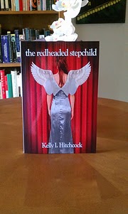
Long time no see! The holidays did a number on me; don’t worry, you’ll get to hear all about it in next week’s Wednesday Wrant. Lately, though, I’ve been busy preparing The Redheaded Stepchild for paperback format on CreateSpace. CreateSpace, for those who are unfamiliar, is an Amazon affiliate authors can use to create print-on-demand standard size paperback editions of their books. The Kindle edition is, of course, my bread and butter, but we all have those friends and family who refuse to get with the program and want to know “when can I order my paperback?” I’m doing this for them 🙂
CreateSpace makes it all pretty easy, but it has its share of drawbacks, too. I thought I’d write this post to share my thoughts on the good, the bad, and the ugly of creating a paperback on CreateSpace.
THE GOOD
It’s free. I like free. Free is good. Free takes more work, but free is worth it. They have a pay option, too, starting around $300 for interior design and $300 for cover design. No, thanks. I’m not afraid of hard work.
It’s procedural. They keep a running checklist on what you’ve done, what you’re doing, and what you need to do next. If you get tripped up at any phase in the process, you can go right back to it after you correct any issues.
It calculates production costs. CreateSpace automatically calculates how much each copy will cost to print and distribute, and stubs it in as the minimum price you can set for each copy. This takes the guess work out of pricing the paperback.
The preview tools are easy to use. The Interior Reviewer lets you easily check the swankiness of the inside of your book, and the Cover Creator lets you easily design and preview the front cover, back cover, and spine. With the Cover Creator, you can select one of their predefined themes, which are pretty slick if you don’t already have a good cover image, or use your own if you do (which I of course did). You can also add an author photo, back cover text, and pre-place a barcode.
Distribution to CreateSpace and Amazon. I can have my book on Amazon (for a lower royalty share) and CreateSpace just like that.
They provide Word templates. Their downloadable templates keep you from having to manually define the right and left page margins, headers, footers, copyright pages, dedication pages, etc.
THE BAD
The Cover Creator is limited. You don’t get to customize the font set for the spine text or back cover text or set the location of the author photo. You can set the background and text color for the back cover and spine cover, but the palette is pretty limited. I know, I know, you get what you pay for.
The templates are pretty imperfect. The downloadable templates they distribute contain font sets that aren’t supported by CreateSpace (Myriad Pro in the chapter footers) and they can’t interpret blank pages between chapters. So if you want to insert a blank page between chapters, so that each chapter starts on a right page for example, your blank page will still use a header and footer.
The pay services are expensive. I hate formatting in Microsoft Word just as much as the next guy, but I’m not going to pay over $300 for someone else to do it. I suppose if you know nothing about how to use templates and styles in Word it would be worth it, but I’ll do the work myself, thanks.
THE UGLY
The front cover. I had to modify my cover image in PhotoShop several times to get it to meet their standards. They don’t like any text too close to the margin, and to get it to look normal with the 6×9 cover I had to do some layer adjustment that took much longer than I would’ve liked.
Copy and paste. To get the template to play nice, and to not lose my spot in the manuscript, I had to copy and paste each chapter into the template, change the text styles, and modify each footer since it used a font style that wasn’t supported. Nothing feels more like a waste of time to me than copying and pasting, lather-rinse-repeat fashion.
So all in all, the goods outweighed the bad and the ugly, and it was certainly worth the time it took to format the interior and the cover. I’ll be getting my proof soon, and I’m ridiculously excited to hold an actual copy of my book in my hands!
 Do not adjust your TV – you are, in fact, seeing a paperback version of The Redheaded Stepchild. Late last week, I received my proof copy from CreateSpace, which I quickly ripped open in the lobby of my apartment office. I am ridiculously happy with the way it turned out – the back cover is amazing, and even the spine of the book is very slick.